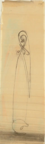
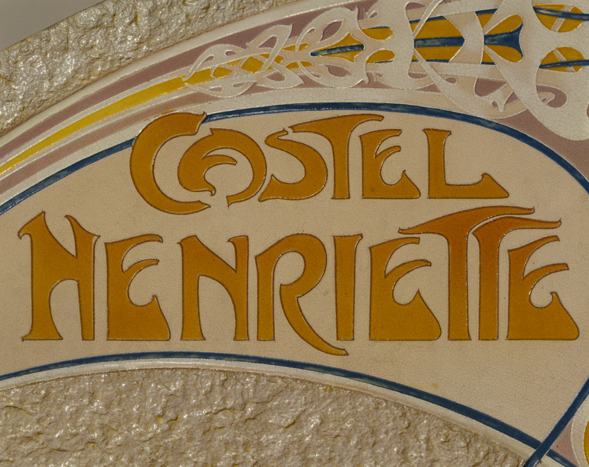
Enseigne pour le Castel Henriette
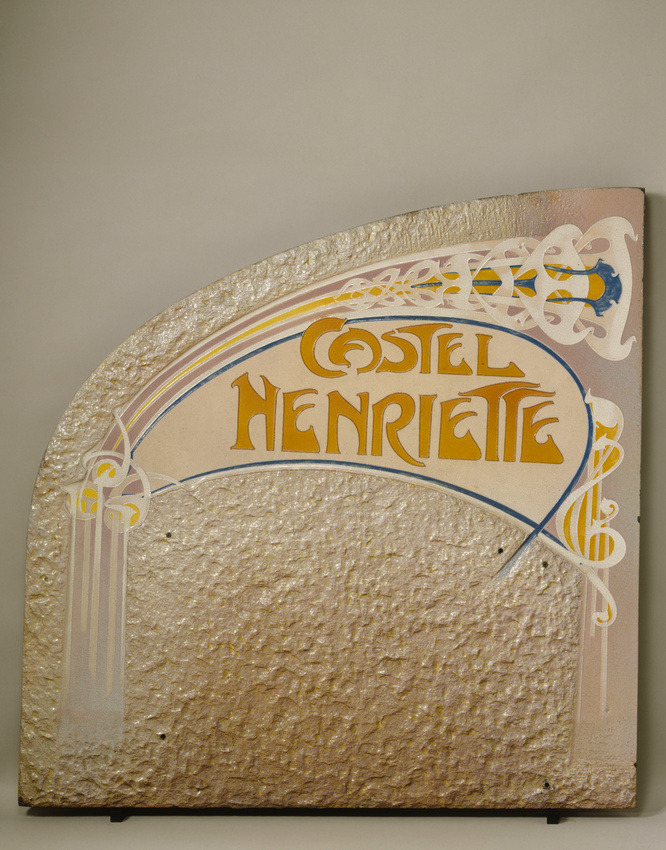
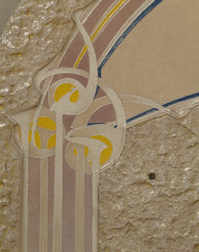
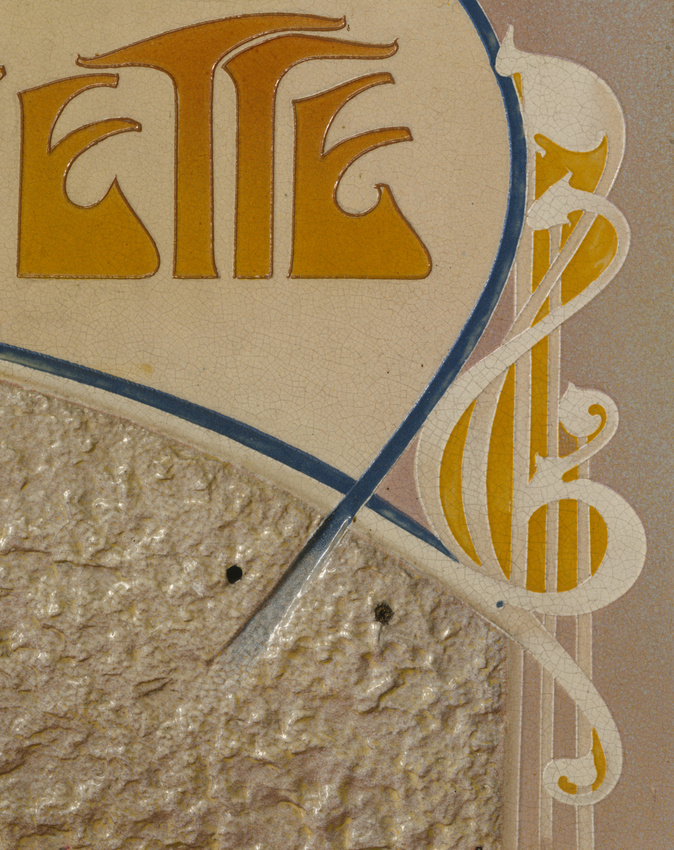
Guimard exploited, with great skill, the decorative possibilities of reconstituted and glazed lava. The process consisted in making the natural lava malleable by crushing and pulverising it, then mixing it with clay and intermediary materials. It could then be used in the manufacturing of large panels.
Guimard's use of glazed lava for the Coilliot house (1898-1900) was spectacular. It must be said that his client, the ceramics manufacturer Louis Coilliot, virtually monopolised the distribution of the material. The facade of his house, completely dressed in lava stone, resembled a monumental advertising display.
Decorated in its bright, smooth colours, the glazed lava went on to grace the nameplates of the villas and houses built by Guimard, including Castel Henriette (1899-1900), as well as the signs of the Paris Metro stations and entrances.
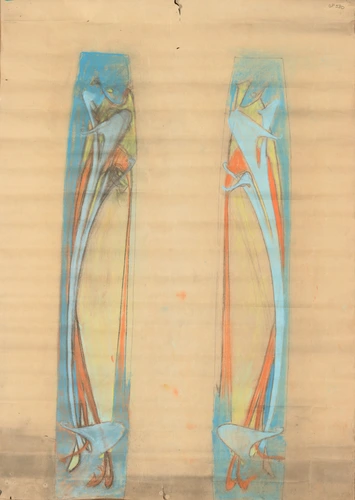
The architect himself designed the graphics for the signs. Their very personal lettering accentuates the novelty of the façade. The outline of the letters and the architectural rhythm work together to give line and colour a central role. Inflated, dilated, stretched by the energy running through them, presenting bold harmonies of pinks and oranges, these letters bring a remarkably unified dynamism to the words, comparable to the dynamism in the facades. But like these, they could sometimes arouse violent reactions, as was the case in 1901 when the Commission du Vieux-Paris (Old Paris Commission) considered the Metro signs. They deplored the "bizarre and fantastical alphabet composed of shapeless letters" and demanded a return to "clear lettering that everyone can read".